Arabic Calligraphy Styles: The 6 Classical Scripts and How to Tell Them Apart
Arabic calligraphy is not one look. It is a set of named scripts with rules, each developed for a purpose, and once you know what separates them you can date and place a piece of Arabic writing at a glance.

Why Arabic developed named scripts
The Arabic calligraphy styles became an art form for a specific historical reason. In a culture where figurative religious imagery was avoided, the written word carried the decorative weight that painting carried elsewhere — and the words being written were, above all, the Quran.
That produced two pressures at once. Sacred text had to be legible and exact, because an ambiguity is an error. And it had to be beautiful, because it was going on the wall of a mosque. Different solutions to that pair of demands became different scripts, each with its own proportional rules.
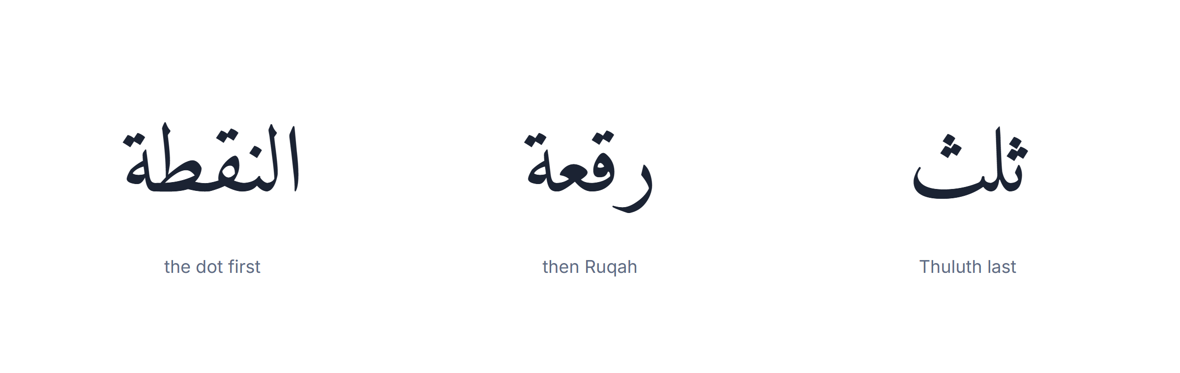
The rules behind the Arabic calligraphy styles are not loose. From the tenth century the scripts were codified around a unit — the rhombic dot made by the pen nib — and a letter’s height is specified as a number of dots. Ibn Muqla, Ibn al-Bawwab and later Yaqut al-Musta’simi turned calligraphy into a system with measurements, and a calligrapher’s training was the reproduction of those measurements exactly.
The six Arabic calligraphy styles, one line each
- Kufic — angular, oldest, architectural.
- Naskh — rounded, legible, the reading script.
- Thuluth — monumental, stacked, the hardest.
- Diwani — woven, Ottoman chancery, hard to forge.
- Ruqʿah — short strokes, everyday handwriting, easiest.
- Nastaliq — hanging baseline, Persian and Urdu.
What follows is not a gallery of Arabic calligraphy styles. It is what each script was for, and what to look at to identify it.
Kufic — the angular original
Where you see it
- Early Quranic manuscripts.
- Mosque and palace inscriptions.
- Modern logos wanting a monumental feel.
How to spot it in two seconds
- Straight lines and right angles, almost no curve.
- Long flat horizontals, short verticals.
- It reads as architecture rather than handwriting.
Kufic is the oldest of the Arabic calligraphy styles, taking its name from the city of Kufa in Iraq, and it is the script of the earliest surviving Qurans.
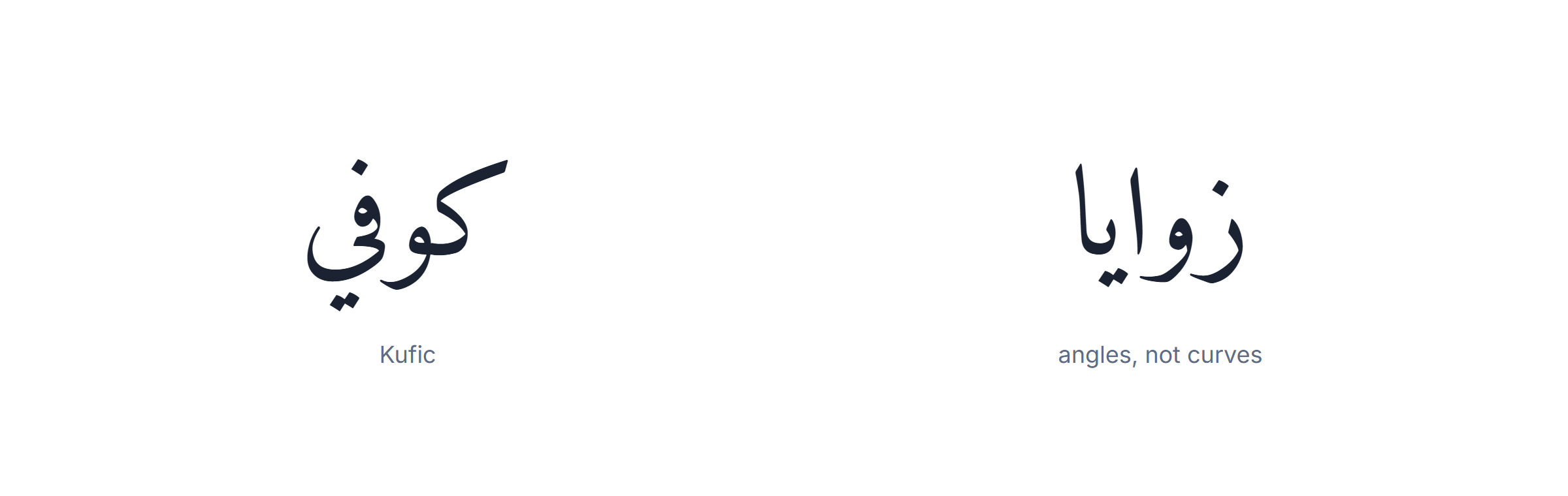
What to look for: straight lines and angles instead of curves. Horizontal strokes are long and flat, verticals are short, and the whole line reads as architecture rather than handwriting.
What it was for: early Quranic manuscripts, then increasingly for inscriptions — carved in stone, laid in brick, worked into tile. Square Kufic, where the letters are fitted into a strict grid, was developed specifically so that text could be built out of bricks on a wall.
What Kufic was built for
- Early Quranic manuscripts, before Naskh took over book copying.
- Stone, brick and tile inscriptions, where angles cut cleanly.
- Monumental display, which is what modern designers still use it for.
Kufic variants among the Arabic calligraphy styles
- Square (banna’i) Kufic — letters fitted to a grid so text can be built from brick.
- Foliated Kufic — strokes ending in leaf shapes.
- Knotted / plaited Kufic — verticals interlaced into a band.
Kufic was largely replaced for book copying by the eleventh century because it is slow to write and, in its more decorative forms, genuinely hard to read. It never left architecture, and it is the style modern designers reach for most often when they want Arabic to look monumental.
Naskh — the one you are reading
How to spot it in two seconds
- Even, rounded letters of consistent size.
- A clear flat baseline.
- It looks ordinary — that is the point.
Naskh — from the root meaning “to copy” — is the one of the Arabic calligraphy styles that replaced Kufic for books, and it is the ancestor of nearly every Arabic typeface in use today. If you are reading Arabic on a screen, you are almost certainly reading a Naskh derivative.
What to look for: rounded, even letters of consistent size, sitting on a clear baseline with generous space between words. It is the most ordinary-looking of the scripts, and that is the point.
What it was for: copying at length. Naskh is fast to write, compact enough to fit a lot of text on a page, and legible at small sizes — the three properties a manuscript tradition needs. Most printed Qurans use it, as does virtually every Arabic newspaper.
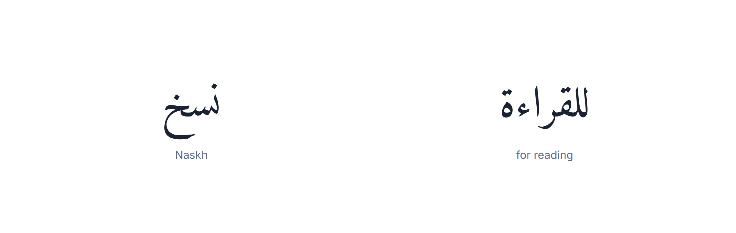
Fonts that follow this one of the Arabic calligraphy styles
- Amiri — an open revival of a classic Naskh metal face, OFL.
- Noto Naskh Arabic — Google’s, broad coverage, safe default.
- Tahoma and Arial — already on Windows, the pragmatic choice for a shared document.
For anything meant to be read rather than admired, Naskh is the correct choice, and the free fonts that follow it well — Amiri, Noto Naskh Arabic — are the safest defaults for a document.
Thuluth — the monumental one
How to spot it in two seconds
- Tall verticals dominating the composition.
- Letters stacked and overlapping rather than in a line.
- No usable baseline at all.
Thuluth is the script of mosque walls, and of all the Arabic calligraphy styles it is traditionally regarded as the hardest to master. Its name means “a third”, usually explained as a reference to the proportion of the pen width used for certain strokes.
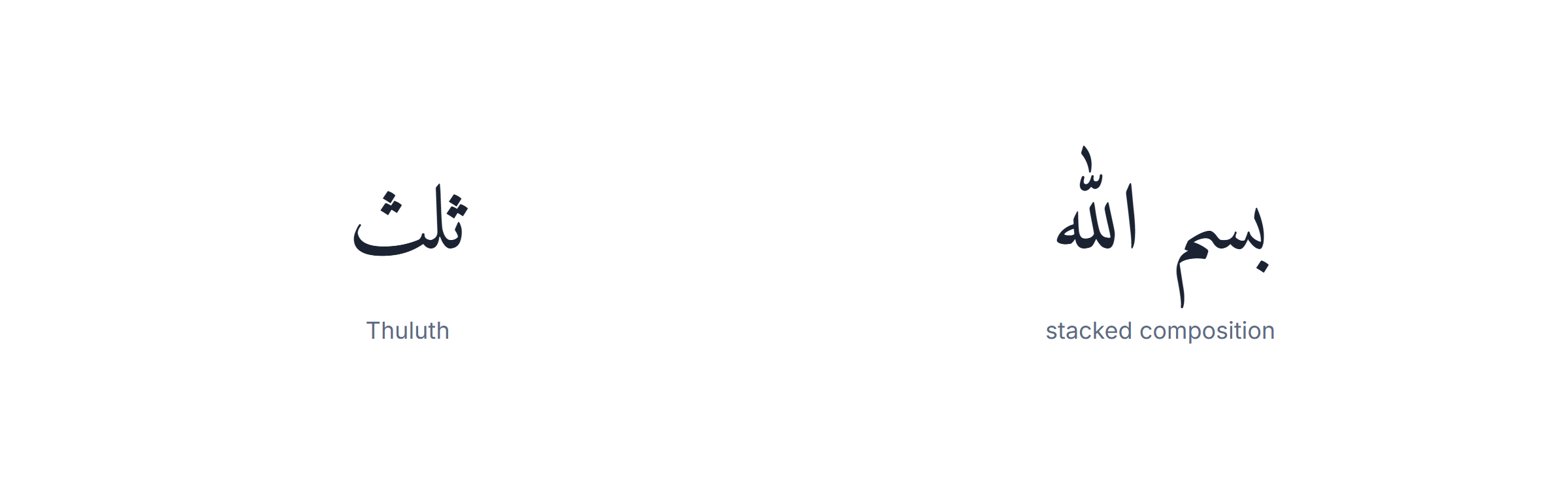
What to look for: tall vertical strokes, long sweeping curves, and letters that overlap and stack rather than sitting in a line. A Thuluth composition is designed as a shape, not typed as a sentence.
What it was for: display. Chapter headings in manuscripts, inscriptions, mosque decoration, and the phrases that had to carry weight. It is deliberately not a reading script — a page of continuous Thuluth would be exhausting.
Because a Thuluth piece is composed rather than set, of all the Arabic calligraphy styles it is the style a font reproduces least well. A font can give you the letterforms; it cannot make the compositional decisions that are the substance of the style.
Diwani — the Ottoman chancery hand
How to spot it in two seconds
- Letters woven together with almost no gaps.
- A strong diagonal, curving up at the end of a line.
- In the Jali variant, every gap filled with dots.
Of the Arabic calligraphy styles, Diwani was developed in the Ottoman court and takes its name from the dīwān, the chancery. It was the script of official documents, and part of its design was deliberate: densely interlocked letters are extremely difficult to forge or alter.
What to look for: letters flowing into one another with almost no gaps, a strong diagonal movement, and words that curve upward toward the end of a line. Where Thuluth stacks, Diwani weaves.
What it was for: decrees, correspondence and anything requiring an official hand. Its ornamental variant, Diwani Jali, fills every remaining space with dots and flourishes — originally a security feature, since there is no room left to insert a word.
Diwani is among the most beautiful Arabic calligraphy styles and genuinely hard to read quickly, which is why it appears on invitations and logos and almost never in body text.

Ruqʿah — the everyday hand
Ruqʿah is the one of the Arabic calligraphy styles most people in the Arab world actually write by hand, and it is the one least represented in font galleries — which tells you something about what those galleries are for.
What to look for: short, economical strokes; letters sitting close together; almost no flourishes; and a distinctive downward slope to the right-hand side of the line. Dots are often merged into small dashes to save time.
What it was for: speed. It was developed in the Ottoman period for everyday writing and became the standard taught in schools across much of the Arab world. If you have seen a handwritten note in Arabic, you have seen Ruqʿah.

How to spot it in two seconds
- Short, cramped strokes with no ornament.
- A distinct downward slope on the right of the line.
- Dots merged into small dashes to save time.
Why it is the first of the Arabic calligraphy styles to learn
- Short strokes, so pen control develops quickly.
- Few rules, so mistakes are obvious and correctable.
- No ornament to hide behind, which is exactly why it teaches proportion.
- It is what people actually write, so the practice has a use outside practice.
It is also the easiest of the six Arabic calligraphy styles to learn, for exactly the reasons that made it popular: few rules, short strokes, no ornament.
Nastaliq — the Persian hanging script
How to spot it in two seconds
- The whole word slopes down from right to left.
- Dramatic thick-to-thin stroke contrast.
- If it is a page of Urdu, it is almost certainly this.
Among the Arabic calligraphy styles, Nastaliq developed in Persia in the fourteenth century, and it is the reason a page of Urdu looks immediately different from a page of Arabic even though the alphabet is nearly the same.
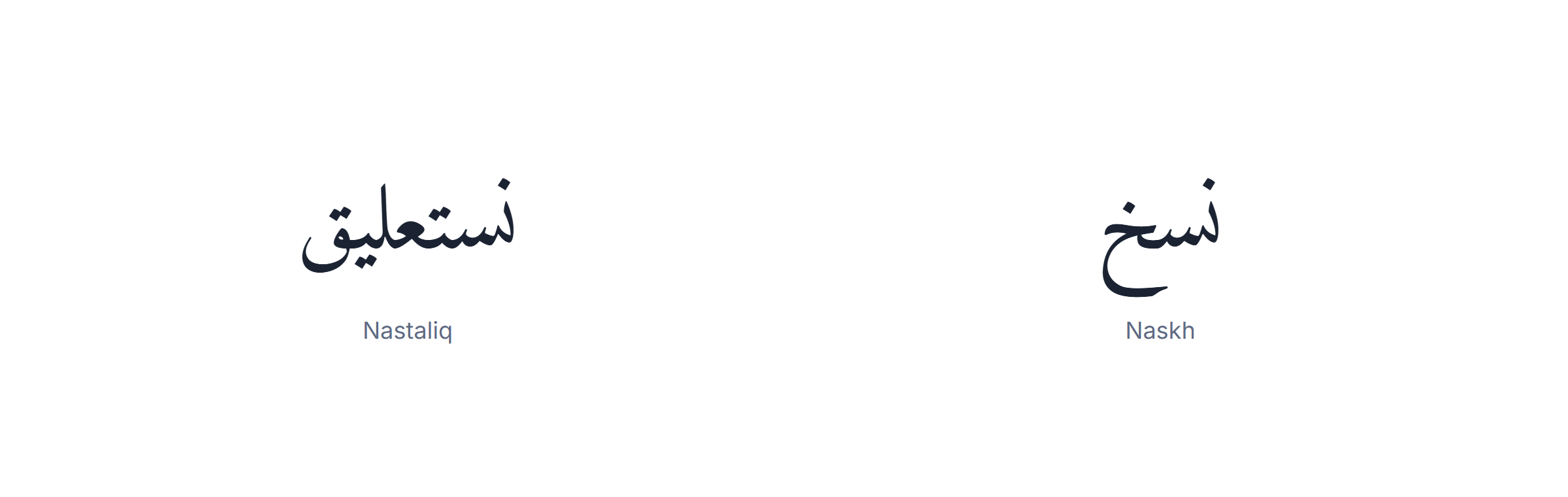
What to look for: a sloping baseline. Words begin high and descend toward the left, so the line looks as if it is hanging rather than sitting. Strokes vary dramatically in thickness.
What it was for: Persian poetry, and later Urdu in general. Urdu newspapers and books are still set in Nastaliq, which is why Urdu typesetting is technically much harder than Arabic typesetting — the sloping baseline defeats a simple horizontal layout engine.
It is worth being precise about where Nastaliq sits among the Arabic calligraphy styles: Nastaliq is an Arabic-script style, not an Arabic-language one. Setting Arabic text in Nastaliq is not wrong, but it reads as foreign, roughly the way English set in blackletter reads as German.
Telling the Arabic calligraphy styles apart in five seconds
| If you see… | It is probably |
|---|---|
| Straight lines and right angles, no curves | Kufic |
| Even rounded letters on a flat baseline, easy to read | Naskh |
| Tall verticals, letters stacked into a shape | Thuluth |
| Letters woven together, curving up at the line end | Diwani |
| Short cramped strokes sloping down on the right | Ruqʿah |
| The whole word hanging and sloping to the left | Nastaliq |
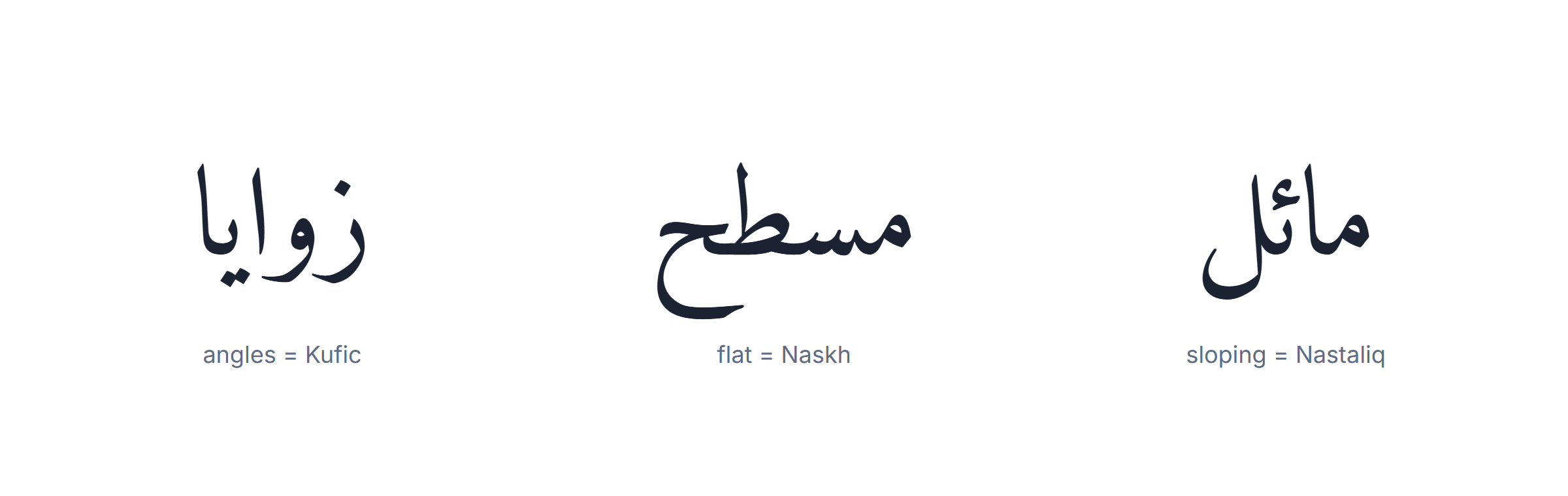
One shortcut across the Arabic calligraphy styles works surprisingly often: look at the baseline. Flat means Naskh or Ruqʿah, absent means Thuluth or Diwani, sloping means Nastaliq, and rigid and grid-like means Kufic.
The proportional system behind the Arabic calligraphy styles
Who codified it
- Ibn Muqla (10th c.) — set the proportional system.
- Ibn al-Bawwab (11th c.) — refined it and raised Naskh.
- Yaqut al-Mustaʿsimi (13th c.) — reformed the pen cut.
The three units
- The dot — one press of the nib, a rhombus. Everything is measured in these.
- The alif — a fixed number of dots high, different per script.
- The circle — its diameter equals the alif height; letters are checked against it.
What the numbers actually are
They are not universal. Thuluth sets the alif at roughly nine dots, Naskh at about five, Ruqʿah lower still. That single ratio changes the whole texture of a page, which is why the same sentence in two of the Arabic calligraphy styles occupies visibly different space.
Why it was codified
- Sacred text had to be reproducible exactly, across copyists and centuries.
- A measured system can be taught and examined; a style cannot.
- It made the licence (ijāzah) meaningful — there was something objective to pass.
Reading a piece of Arabic calligraphy
What you are looking at
- A composition, not a sentence set in a font.
- Proportions fixed by rule, not by eye.
- Usually a phrase the intended viewer already knows by heart.
Where to start on the page
- Find the baseline first — it identifies the script.
- Find the tallest verticals; in Thuluth they anchor the composition.
- Read right to left, but in a stacked piece read outward from the densest cluster.
Why some pieces are unreadable on purpose
Not every composition is meant to be read at speed. In Thuluth and Diwani, and in most modern hurufiyya, legibility is traded for shape deliberately. A viewer is expected to recognise the phrase, not decode it — which is only possible because the phrases used are ones everyone knows.
What to look at in a signed piece
- The signature line, which names the calligrapher and often the script.
- The date, frequently in the Hijri calendar.
- Whether the marks are Quranic or standard — that tells you the intended use.
Mistakes people make with the Arabic calligraphy styles
The five most common
- Choosing the style before checking the words. An error is invisible in Diwani.
- Setting Arabic in Nastaliq. Correct script, wrong language — it reads as Urdu.
- Using a display script for body text. A page of Thuluth is exhausting to read.
- Screenshotting instead of exporting. A picture of Arabic is not Arabic.
- Not embedding the font. Correct on your machine, broken on the reader’s.
The two-minute check before anything permanent
- Type the text yourself rather than copying an image.
- Have it read back by someone who reads Arabic.
- Confirm the letters are joined in the final artwork, at final size.
The tattoo-specific ones
- Working from an image found in a search rather than from typed text.
- Accepting artwork where the letters are detached — a font failure made permanent.
- Mirroring the design, which reverses the Arabic.
The pen, the ink and the licence
Every one of the Arabic calligraphy styles is defined partly by the instrument that made it, which is why they look the way they do and why a mouse cannot reproduce them.

The qalam. The traditional pen is cut from reed — qalam means reed — and its nib is trimmed to a flat edge at an angle. That angle is the whole secret of the look: a stroke pulled in one direction is thick and the same stroke pulled across is thin, and every classical letterform is designed around that behaviour. Each script has its own nib width, and a calligrapher cuts a different pen for Thuluth than for Ruqʿah.
The dot. Press the nib once and it leaves a rhombus. That mark is the unit of measurement for the entire system: an alif is specified as a fixed number of dots high, and every other letter is proportioned against the alif. When Ibn Muqla codified the scripts in the tenth century, this is what he codified — not shapes to copy but ratios to obey.
The ink and the paper. Traditional ink is soot-based and thick enough to sit on the surface rather than bleed into it. Paper was often burnished with starch or egg white so the pen would glide instead of catching. Both choices exist to make a single unbroken stroke possible, because a stroke that has to be repaired is a failed stroke.
The ijazah. The tradition has a formal licence. A student copies a master’s work until the master judges the reproduction faithful, and then grants an ijāzah — permission to sign work in that script. It can take years per style, and it is the reason a calligrapher will tell you which scripts they are licensed in rather than claiming all of them.
None of this is required to appreciate the results, but it explains something practical: when a font “does Thuluth”, it is offering the letterforms without the pen behaviour, the proportional system or the compositional judgement. It gets you a resemblance, which for most purposes is enough, and it is worth knowing that is what it is.
What calligraphers are doing now
Who is doing it
- eL Seed, the best-known calligraffiti practitioner.
- Type designers behind Noto and Amiri.
- Studio calligraphers working on brand identity.
Where you actually meet it today
- Airport, mosque and museum commissions across the Gulf and North Africa.
- Brand identity, where custom lettering beats a font.
- Murals, which is where most people first see it at scale.
Four strands in modern Arabic calligraphy styles
- Calligraffiti — classical letterforms at mural scale.
- Hurufiyya — the letter as abstract form, often unreadable by design.
- Brand and logo lettering — Thuluth and Diwani principles tuned for small sizes.
- Type design — the engineering problem of joined, marked, position-dependent letters.
The Arabic calligraphy styles did not stop developing in the Ottoman period, and the contemporary work is where most people actually encounter Arabic calligraphy today.

Calligraffiti merges the classical scripts with street art and is the most visible modern strand — large-scale murals that use Thuluth or Kufic letterforms at building size. The Tunisian-French artist eL Seed is the best-known practitioner, and the approach has spread from gallery walls to city commissions across the region.
Hurufiyya — literally “letterism” — is the older modernist movement, running from the mid-twentieth century, in which painters treated the Arabic letter as an abstract form rather than as text. Much of it is not readable at all, which is the point: it takes the visual grammar of the script and drops the meaning.
Logo and brand work is where the classical styles earn most of their money now. A large share of Arabic corporate identity is custom lettering built on Thuluth or Diwani principles, tuned to be legible at small sizes — a genuinely hard brief, since neither script was designed for it.
Type design is the quiet one. Fitting a script whose letters change shape by position, join to their neighbours and carry marks above and below into a system that has to render on a phone is a serious engineering problem, and the last two decades have produced far better Arabic typefaces than the fifty years before them. Noto Naskh Arabic and Amiri came out of that work.
Architecture and public space keep commissioning the classical scripts at scale — airports, mosques, museums and metro stations across the Gulf and North Africa carry work by living calligraphers, usually in Thuluth or a squared Kufic, and usually at a size where the proportional system is doing visible work.
The through-line across the Arabic calligraphy styles is that the rules still matter. Contemporary Arabic calligraphy breaks them deliberately and visibly, which only reads as a choice if the underlying proportions are understood first — the same relationship a jazz musician has with scales.
Which style to use for what
| Purpose | Style | Why |
|---|---|---|
| A document people must read | Naskh | Built for legibility at length |
| A logo or a title | Thuluth or Diwani | Designed to be looked at, not read |
| A tattoo or engraving | Naskh first, then decide | Verify the spelling in a readable script before styling it |
| Something architectural or geometric | Square Kufic | It was invented for exactly this |
| Urdu or Persian text | Nastaliq | The expected script for those languages |
| Handwriting practice | Ruqʿah | Fewest rules, fastest to write |

The mistake worth avoiding when choosing between Arabic calligraphy styles: choosing the style before verifying the words. An error is invisible in Diwani and obvious in Naskh. Get the text right in a plain script, have it checked, and only then make it decorative.
If you want to learn one yourself
The Arabic calligraphy styles are unusually teachable compared with most art forms, because the rules are explicit and the feedback is immediate — a stroke either matches the proportion or it does not.
Of the Arabic calligraphy styles, start with Ruqʿah, not with the beautiful one. Everybody wants to learn Thuluth and almost nobody should start there. Ruqʿah has short strokes, few rules and no ornament, and it builds the pen control that every other script assumes you already have.
Learn the dot before the letters. The first exercise in the tradition is not a letter — it is pressing the nib to make a clean rhombus, over and over, until the shape is consistent. Every proportion in every script is measured in those, so an inconsistent dot makes correct letters impossible.
Copy one master, not several. The tradition works by faithful reproduction of a single exemplar until it is internalised. Mixing sources produces a hand that belongs to no script, which is the most common outcome for self-taught learners.
Expect the timescale to be real. Basic competence in Ruqʿah is a matter of months of regular practice. An ijāzah in Thuluth is measured in years, and that is with a teacher correcting every session.
A digital shortcut across the Arabic calligraphy styles, worth using honestly: setting a phrase in a good font first shows you the letter shapes and the joins clearly, which is a useful reference while your own hand is still unreliable. It is a reference, not practice — the pen is the practice.
Using them digitally
How well each script survives becoming a font
- Naskh — almost perfectly; it was linear to begin with.
- Ruqʿah — well.
- Kufic — well in its square form, less so foliated.
- Thuluth and Diwani — poorly; their substance is composition.
- Nastaliq — technically hardest, because of the sloping baseline.
Fonts approximate the Arabic calligraphy styles, and how well they do it varies enormously by style. Naskh translates almost perfectly — it was a linear script to begin with. Ruqʿah translates well. Thuluth and Diwani translate poorly, because their substance is composition rather than letterforms, and a font can only give you the letters.
Two practical rules for publishing any of the Arabic calligraphy styles digitally. Embed the font when a document leaves your machine, or the reader’s software substitutes something that cannot join Arabic letters. And export rather than screenshot — a picture of Arabic is not Arabic, and nothing can read, search or resize it.
One more digital-only caution about the Arabic calligraphy styles. Arabic set as an image cannot be searched, selected, translated or read aloud by a screen reader, and it will not scale on a phone. For decoration that is a fair trade; for a heading on a page it costs you the thing a heading is for. Keep the text as text wherever the words are meant to be read rather than admired.
If you want to see a phrase in several of these styles before committing to one, our Arabic calligraphy generator renders the same text across twenty-two fonts and exports as PNG, SVG or PDF with the font embedded. To type the phrase in the first place, the Arabic keyboard handles the letters and the punctuation, and the harakat keyboard adds the vowel marks if the piece is meant to be read aloud.