Arabic Fonts: The 10 Best Free Ones and How to Choose
An Arabic font has to draw every letter four times over, hang the line from a spine rather than a baseline, and leave room for marks that stack above and below. Most free ones only manage two of the three.
What makes Arabic fonts different from Latin ones
Four things a Latin font never has to do
- Draw every letter up to four times, one per position in the word.
- Hold a joining stroke at a constant height across the whole word.
- Position marks above and below without collision.
- Survive a bold weight in a script with no tradition of one.
Every letter has up to four shapes
A Latin font needs one drawing per letter, plus a capital. Arabic fonts need up to four drawings of the same letter — isolated, initial, medial and final — because Arabic letters join to their neighbours. The letter ha is a small circle on its own, a loop at the start of a word, a knot in the middle and a tail at the end. All four are the same letter. A font that ships only one of them is not a broken font in the Latin sense; it is a font that cannot write the language at all.
This is the first thing to understand about Arabic fonts, and it explains most of what follows: why they are larger files, why fewer of them exist, why so many free ones are half-finished, and why a design that looks right in a preview image falls apart the moment you type into it.
The line has a spine, not a baseline
Latin type sits on a baseline. Arabic type hangs from a connecting stroke that runs through the middle of the word. Good Arabic fonts keep that stroke at a constant height so words look welded rather than stacked. Poor Arabic fonts wobble, and the eye reads the wobble as amateurishness long before it can say why.
Diacritics stack above and below
Short vowels, the shadda, the sukun and the tanwin all sit outside the letter body. A font has to leave room for them and position them per letter. Most free Arabic fonts either clip them at the top of the line or centre them so badly that a fatha lands on the wrong letter. If you will ever set a Quranic or teaching text, this single test separates usable Arabic fonts from decorative ones.
There is no bold, historically
Arabic calligraphy has no tradition of emphasis by weight. Weight in Arabic fonts is a modern, screen-driven addition, and it is the part most often done badly: a “bold” that is simply the regular outline swollen by an algorithm destroys the thick-thin contrast the script depends on. Families that were drawn weight by weight — Cairo, Tajawal, Almarai — look right in bold; families that were inflated do not.

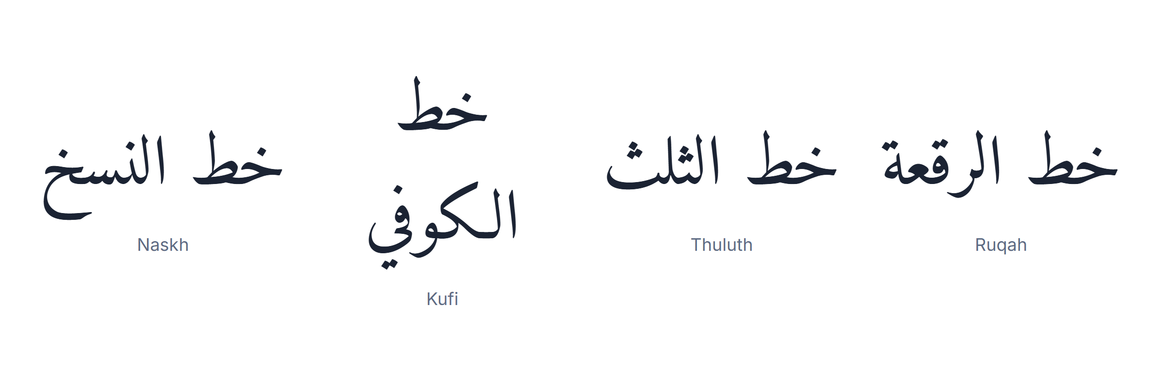
The five Arabic font styles you will actually meet
Almost every one of the Arabic fonts you will download descends from one of five calligraphic hands. Knowing which is which turns an unlabelled list of 400 files into a short list of four.
In one line each:
- Naskh — round, for reading.
- Kufi — angular, for headings.
- Thuluth — ceremonial, for titles.
- Diwani — ornamental, for invitations.
- Ruqah — everyday, for anything informal.
Naskh — the reading hand
Round, legible, modest. Naskh is what books and newspapers are set in and what nearly all body-text Arabic fonts imitate. If you are unsure, you want Naskh.
Kufi — the angular hand
Square, geometric, architectural. The oldest style and the one that reads as “logo” to a modern eye. Excellent for headings, hostile to paragraphs.
Thuluth — the ceremonial hand
Tall, sweeping, heavily overlapping. Used for titles, mosque inscriptions and the covers of books, essentially never for text. Most Thuluth-flavoured Arabic fonts are display faces.
Diwani — the ornamental hand
Cursive, densely packed, curling. It was the chancery hand of the Ottoman court. Beautiful, almost unreadable at small sizes, and the style most often chosen for wedding invitations.
Ruqah — the everyday hand
Small, quick, sloping. This is how Arabic is actually handwritten today. Ruqah-based Arabic fonts feel informal and personal in a way that Naskh never does.

The best free Arabic fonts, and what each one is for
All ten of these Arabic fonts are free for commercial use under the SIL Open Font Licence or Apache 2.0, all of them carry the four positional forms, and all of them handle diacritics without clipping. That last condition removes most of what a font-download site will show you.
The short version, if you only want the answer:
- Amiri for print and long text.
- Tajawal or Almarai for body text on screen.
- Cairo for interfaces.
- Scheherazade New for vowelled teaching material.
- Reem Kufi for headings.
- Noto Naskh Arabic when it has to work everywhere.
Amiri — the best free Naskh
A revival of the Bulaq press type, drawn by Khaled Hosny. It is the closest a free font gets to a printed Arabic book, it carries a full set of Quranic marks, and it is the default choice for anything long. Its one weakness is that it looks bookish; it does not want to be a user interface.
Noto Naskh Arabic — the safe one
Google’s universal-coverage family. Not the most beautiful of the Arabic fonts here, but it covers every Unicode Arabic block, ships on most systems, and never produces a missing glyph. When something has to work everywhere, this is the answer.
Cairo — the modern interface face
Geometric, low contrast, with matching Latin. Cairo is the Arabic font you see on app screens and dashboards. It is drawn in real weights from ExtraLight to Black.
Tajawal — Cairo’s quieter sibling
Slightly narrower, slightly warmer, and a little more readable at paragraph length. If Cairo feels too engineered, this is the swap.
Almarai — built for screens
Large x-height equivalent, open counters, four weights. Almarai holds up at 14px better than almost any other free Arabic font, which is exactly where most of them fail.
Reem Kufi — the heading face
A modern Kufi with even stroke weight. Use it for titles and nothing else; it is not a text face and does not pretend to be.
Scheherazade New — the teaching face
Drawn by SIL specifically for careful vowelled text. Its diacritic positioning is the best in this list, so it is the font for language material, children’s books and anything with full tashkeel.
Lateef — the compact one
Also from SIL, narrower and shorter than Scheherazade New. It fits more text in the same space without becoming unreadable, which makes it good for dictionaries and footnotes.
Aref Ruqaa — the handwritten one
A genuine Ruqah face with a matching Latin italic. It is the only Arabic font on this list that feels written rather than set.
Markazi Text — the newspaper one
Designed for dense editorial setting, with a slightly condensed body that saves space in long columns without the cramped feeling of a compressed face.

The comparison table
| Font | Style | Best for | Weights | Licence | Diacritics |
|---|---|---|---|---|---|
| Amiri | Naskh | Long text, Quranic | 4 | OFL | Excellent |
| Noto Naskh Arabic | Naskh | Universal fallback | 2 | OFL | Good |
| Cairo | Modern geometric | Interfaces, apps | 9 | OFL | Adequate |
| Tajawal | Modern geometric | Body text on screen | 7 | OFL | Adequate |
| Almarai | Modern | Small sizes | 4 | OFL | Adequate |
| Reem Kufi | Kufi | Headings only | 5 | OFL | Limited |
| Scheherazade New | Naskh | Teaching, full tashkeel | 4 | OFL | Best in class |
| Lateef | Naskh | Dense text, footnotes | 4 | OFL | Excellent |
| Aref Ruqaa | Ruqah | Informal, personal | 2 | OFL | Good |
| Markazi Text | Naskh | Editorial columns | 4 | OFL | Good |
Two columns in that table decide most choices. Weights tells you whether the family can carry a whole design on its own. Diacritics tells you whether the font survives contact with vowelled Arabic — and it is the column the download sites never show, because testing it requires actually setting text.
Arabic fonts for the web
Four things to get right, in order of how much they matter:
- The subset, which decides the download size.
- The fallback stack, which decides what happens when it fails.
- The direction, which the font cannot fix.
- The line height, which decides whether it is readable.
Load the Arabic subset, not the whole family
An unsubsetted Arabic font is often 200-400 KB because of the positional forms. Google Fonts
serves an arabic subset automatically through unicode-range, which is
usually a five-to-tenfold saving. If you self-host, subset with pyftsubset and keep
U+0600-06FF, U+0750-077F and U+FB50-FDFF.
Always declare a fallback stack
A missing Arabic font does not fall back gracefully — the browser substitutes a system face that may not join letters correctly. Write the stack explicitly:
font-family: "Amiri", "Noto Naskh Arabic", "Segoe UI",
             "Geeza Pro", "Droid Arabic Naskh", serif;
Set the direction, not just the font
Choosing one of these Arabic fonts does nothing for layout. You still need
dir="rtl" and lang="ar" on the element. Without them the font renders
correctly and the punctuation lands at the wrong end of the line.
Raise the line height
Arabic needs more leading than Latin because of the stacked diacritics and the deep
descenders. A line-height of 1.7 to 1.9 is normal where a Latin paragraph would
take 1.5. This single change does more for the readability of Arabic fonts on screen than any
choice of family.

Arabic fonts for print and design
Print is more forgiving of the delicate Arabic fonts and much less forgiving of missing glyphs. Three rules cover most of it.
- Use OpenType, not TrueType, where you can. The ligature and mark-positioning tables Arabic depends on are richer in OTF.
- Check that your layout application has the World-Ready composer switched on. In InDesign, Arabic text set with the standard composer will not join. This is the single most common reason a designer thinks the font is broken.
- Outline nothing until the very end. Converting Arabic fonts to outlines before the text is final freezes the joining behaviour, and any later edit produces isolated letters.
Two more print-specific habits worth keeping:
- Set Arabic and Latin in separate paragraph styles so the sizes can differ.
- Turn off automatic hyphenation entirely; Arabic does not hyphenate.
Sizes behave differently
Arabic letterforms carry more detail per character than Latin ones, so Arabic fonts need roughly 1-2 points more than the Latin size they sit beside to feel equal. Setting both at 10pt makes the Arabic look small and cramped, which is why bilingual documents so often look unbalanced.
Licensing: what “free” actually means
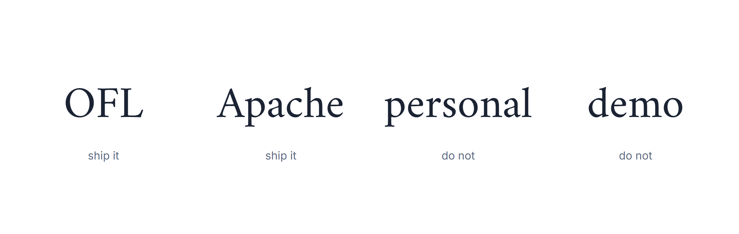
Nearly every font on a free download site carries one of four licences, and the difference matters the moment money is involved.
| Licence | Commercial use | Can you modify? | Catch |
|---|---|---|---|
| SIL OFL | Yes | Yes | Modified versions must be renamed and stay OFL |
| Apache 2.0 | Yes | Yes | Keep the notice file |
| Free for personal use | No | No | The most common trap on font sites |
| Demo / unlicensed upload | No | No | Often an illegal re-upload of a commercial face |
All ten of the Arabic fonts recommended above are OFL or Apache, which is why they are the ten. If you take Arabic fonts from a general download site, read the licence file before the specimen: “free” on those sites usually means free to look at.
How to install Arabic fonts
What each platform needs, in one line:
- Windows — install for all users, every weight.
- macOS — Font Book, then Validate Font.
- iOS — a configuration profile.
- Android — not without root; use per-app fonts.
- Google Docs — More fonts, filtered by Arabic script.
Windows
Unzip, select every .ttf or .otf in the family, right-click and
choose Install for all users. Installing only the regular weight is the usual
cause of a bold that looks synthetic.
macOS
Double-click a file and press Install Font, or drag the whole folder into Font Book. Use Validate Font first: it will tell you if the family is missing the positional forms.
Android
Without root you cannot add system Arabic fonts. Applications that let you pick a font — most reading and note apps — load them from their own storage instead.
iOS and iPadOS
Fonts arrive as configuration profiles. Install the profile in Settings, then approve it under General to make the font available to Pages, Keynote and anything that uses the system font picker.
Google Docs and Microsoft 365
Neither will read a font from your machine when it renders in the browser. In Google Docs use More fonts and filter by Arabic script; in Word online only the built-in Arabic fonts are available, so a document set in Amiri will substitute when a colleague opens it.

Pairing Arabic fonts with Latin type
Bilingual pages fail for one of two reasons: mismatched weight or mismatched personality.
Three pairings that work, as a starting point:
- Cairo + Inter — both geometric, both low contrast.
- Amiri + Source Serif — both bookish, both high contrast.
- Tajawal + Work Sans — both warm, both neutral.
Match the colour, not the classification
Do not try to pair a “serif” Arabic with a serif Latin — the categories do not map. Pair by how dark the paragraph looks from a metre away. Amiri sits well beside Source Serif; Cairo sits well beside Inter; Aref Ruqaa needs a Latin italic beside it or the page tips.
Use families that ship both scripts
The safest pairings are Arabic fonts drawn with a matching Latin by the same designer: Cairo, Tajawal, Markazi Text and Aref Ruqaa all include one. The weights then line up by construction rather than by eye.
Size the Arabic up
As in print, Arabic on screen usually needs 1-2px more than its Latin partner to read as the
same size. A single CSS rule scoped to [lang="ar"] handles it.

Why Arabic fonts break, and how to tell whose fault it is
When Arabic comes out wrong, one of four things has gone wrong, and they look similar enough that people blame the font when it is usually not the font.
The four symptoms, in the order worth checking them:
- Letters not joining — almost always the application.
- Boxes or question marks — a missing glyph, so the font.
- Diacritics misplaced — the font’s mark-positioning table.
- Text reading backwards — bidi, never the font.
The letters do not join
Almost always the application, not the Arabic font. Either the layout engine is not shaping — InDesign without the World-Ready composer, an old canvas renderer, a PDF generated from a non-shaping library — or the text was pasted as isolated presentation forms.
Boxes or question marks
A genuinely missing glyph. The font does not cover that character. Noto Naskh Arabic exists for exactly this case.
The diacritics sit in the wrong place
This one really is the font. The mark-positioning table is incomplete. Switch to Scheherazade New or Amiri.
The text is backwards
Never the font. This is bidirectional layout: the string is stored correctly and displayed
under the wrong base direction. Set dir="rtl".
Running through those four in order will identify the cause faster than trying more Arabic fonts, which is the usual and least productive response.
Arabic fonts and typing
A font is only half of writing Arabic. The other half is getting the characters in, and this is where most people give up: they find beautiful Arabic fonts, install them, and then have no way to produce Arabic text to set in them.
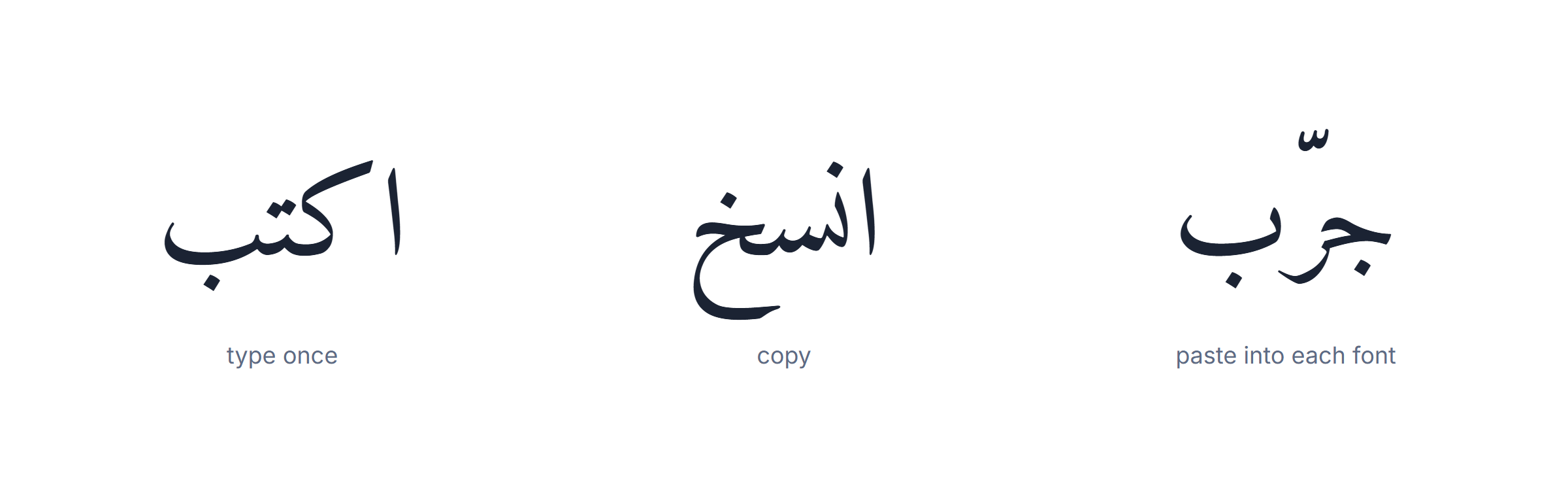
You do not need to install a system layout to test a font. Type the sample in our online Arabic keyboard, copy it, and paste it wherever you are trying the font. If you would rather type in Latin letters and have them converted, the transliteration tool does that, and harakat covers adding the short vowels that will test the font’s diacritic positioning.
For decorative work — the Thuluth and Diwani end of the range — our calligraphy generator renders text in several of these styles directly, which is faster than installing five display Arabic fonts to compare them.
Choosing, in one paragraph
If it is body text, use Amiri for print and Tajawal or Almarai for screen. If it is an interface, use Cairo. If it carries full vowels, use Scheherazade New. If it is a heading, use Reem Kufi. If it must never fail, use Noto Naskh Arabic. Those six Arabic fonts cover perhaps ninety per cent of real work, and every one of them is free for commercial use.
The three-minute test before you commit
- Set a vowelled sentence and look at where the fatha lands.
- Set the same paragraph at 14px and read it on a phone.
- Set one word in regular and in bold and check the thick-thin contrast survives.
Any Arabic font that passes those three is safe to build on. Most of the free Arabic fonts on general download sites fail the first one.

A short history of Arabic fonts
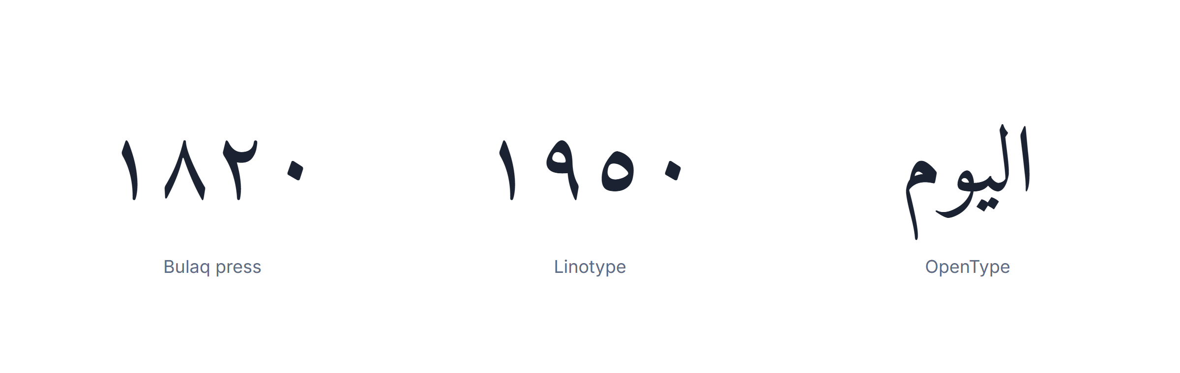
Four dates that explain the state of Arabic fonts today:
- 1455 — Gutenberg prints in Latin.
- 1820 — the Bulaq press begins sustained Arabic printing in Cairo.
- 1991 — Unicode 1.0 fixes the code points.
- 2011 onwards — Google Noto and SIL make good Arabic fonts free.
Three hundred years behind Latin
Gutenberg printed in 1455. The first sustained Arabic printing in the Arab world did not begin until the Bulaq press opened in Cairo in 1820. The gap was technical as much as political: movable type suits an alphabet of about seventy discrete shapes, and Arabic needs several hundred once positional forms and ligatures are counted. Early European attempts at Arabic fonts cut hundreds of sorts and still produced pages that Arab readers found crude.
The Linotype compromise
Hot-metal composition in the twentieth century forced a brutal simplification. To fit Arabic onto a machine designed for Latin, typefounders cut the number of forms down — often to two per letter instead of four — and flattened the calligraphic contrast. A generation of Arabic fonts inherited that flattening, and the “newspaper Arabic” look of mid-century printing is its signature. It is still visible in some free Arabic fonts today, because they were digitised from those metal originals.
Unicode, then OpenType
Unicode 1.0 in 1991 gave Arabic a stable set of code points, but it was OpenType, and
specifically the init, medi, fina and isol
features, that finally let a single font file carry all four shapes and let software pick between
them. Every one of the modern Arabic fonts recommended above depends on that mechanism. It is
also why a font from the pre-OpenType era can look correct in a specimen and fail completely in a
sentence.
Where the free ones came from
The current abundance of high-quality free Arabic fonts is roughly fifteen years old and has two sources: Google’s Noto and Early Access programmes, which commissioned families for scripts the web was underserving, and SIL International, whose linguistic mission produced Scheherazade New and Lateef. Almost everything else free and good is downstream of one of those two.
Variable Arabic fonts
A variable font stores one outline plus rules for deforming it, so a single file covers every weight between the extremes. For Latin this is mostly a bandwidth saving. For Arabic fonts it is more than that, because weight is not the only axis worth varying.
Where a variable Arabic font pays off:
- Three or more weights on one page.
- A design that animates weight on interaction.
- Any page where total font transfer is already over 150 KB.
The axes that matter for Arabic
- Weight — the usual one, and the one that most needs to be drawn rather than interpolated badly.
- Slant — rarely meaningful in Arabic, where there is no italic tradition.
- Elongation — an Arabic-specific axis that stretches the joining stroke, doing in a controlled way what the tatweel character does crudely.
Cairo, Tajawal and Reem Kufi all ship variable versions. If you are loading more than two weights on a web page, the variable file is almost always smaller than the statics it replaces.
Arabic fonts for Quranic text
Quranic setting is the hardest test any of these Arabic fonts will face, because it needs every diacritic, several marks that appear nowhere else, and positioning accurate enough that a misplaced sukun is a real error rather than a cosmetic one.
- Amiri ships a dedicated Quran variant with the full mark set and the traditional Naskh proportions.
- Scheherazade New handles heavy vowelling more reliably than anything else free.
- KFGQPC Uthman Taha Naskh, from the King Fahd Complex, is the reference face for Mushaf setting, though its licence is more restrictive than OFL.
The test to run before committing: set a fully vowelled verse, then zoom to 400 per cent and check that no mark overlaps a letter and none is clipped by the line above. Most general-purpose Arabic fonts fail this instantly.

Where to get Arabic fonts safely
The difference between a good source and a bad one is not quality, it is licensing clarity.
- Google Fonts — every family is OFL or Apache, the licence is stated, and the Arabic subset is served automatically. The safest single source.
- SIL International — Scheherazade New and Lateef, both OFL, both drawn for linguistic accuracy rather than fashion.
- The designer’s own repository — Amiri lives on GitHub. You get the licence file, the source and the issue tracker.
- Adobe Fonts — excellent Arabic fonts, licensed through the subscription, not downloadable for arbitrary reuse.
- General font-download aggregators — large catalogues, unreliable licensing, frequent re-uploads of commercial faces. Useful for browsing, risky for shipping.
Three questions before you download anything
- Is there a licence file in the archive? No file, no use.
- Does the family include more than the regular weight?
- Does the specimen show vowelled text, or only a single unvowelled word?
How to compare two Arabic fonts properly
Comparing Arabic fonts from specimen images is how people end up with a font that fails in production. The comparison that works takes one paragraph of real text and holds everything else constant.
- Use the same string. One sentence with a vowelled word, a long word, a word ending in ta marbuta and a number.
- Use the same size and line height. Different defaults make a worse font look better.
- Look at the joining stroke. Does it stay at one height across the word?
- Look at the counters — the enclosed spaces in sad, ha and mim. If they close up at small sizes the font will not work as body text.
- Check the tooth heights in sin and shin. Uneven teeth are the clearest sign of a hurried digitisation.
- Print it. Screen rendering hides contrast problems that paper exposes.
The strings worth keeping in a scratch file
- A fully vowelled sentence, for diacritic positioning.
- A word with four different letter positions in it.
- A line mixing Arabic and Latin, for the pairing test.
- A line of eastern and western numerals.
- A long compound word, for the joining stroke.
What Arabic fonts cost a page
Arabic fonts are heavier than Latin ones, and on a slow connection the difference is visible.
| Choice | Typical transfer | When it is the right call |
|---|---|---|
| Full family, unsubsetted | 200-400 KB per weight | Almost never on the web |
| Arabic subset, one weight | 30-60 KB | Body text on a content site |
| Variable font, subsetted | 60-120 KB total | Three or more weights needed |
| System font stack | 0 KB | Interfaces where brand is not the point |
| Self-hosted WOFF2 | Subset size, one round trip | When you need control over caching |
Four rules that cost nothing
- Serve WOFF2 and nothing else. Every browser that matters supports it.
- Preload only the one face used above the fold.
- Set
font-display: swapso text is readable while the font loads. - Never load a display face for body text just because it is already in the page.
Colour fonts, emoji and the Arabic script
Colour font formats — COLR, SVG-in-OpenType — work with Arabic exactly as with Latin, and are used mainly for decorative Arabic fonts and for logos. Two practical notes:
- Colour Arabic fonts rarely carry the full positional set. Check all four forms before using one for anything longer than a word.
- Emoji inside Arabic text is a bidi question, not a font question. Emoji are neutral characters, so they behave like punctuation and move to the wrong end for the same reason.
Accessibility and Arabic fonts
Four choices affect Arabic readers more than they affect Latin readers.
- Size. Arabic carries more detail per character, so the minimum comfortable body size is higher. 17-18px where a Latin page uses 16px.
- Line height. 1.7 to 1.9, for the stacked diacritics.
- Weight. Very light weights of geometric Arabic fonts lose the thick-thin contrast that distinguishes letters. Avoid anything under 300 for body text.
- Never justify without a shaping-aware engine. Justification in Arabic is done by stretching the joining stroke, not by widening word gaps; a naive engine produces rivers.
Screen readers
A screen reader picks its voice from the lang attribute, not from the font. An
Arabic paragraph without lang="ar" will be read aloud by an English voice, letter by
letter. No choice of Arabic font changes this.
The Arabic fonts checklist
Before shipping anything set in Arabic fonts, run these:
- Licence file present and permits your use.
- All four positional forms render inside a real sentence.
- Fully vowelled text does not clip or collide.
- Every weight you use is a real drawn weight, not synthetic.
- Line height at least 1.7.
- Arabic sized 1-2 units larger than adjacent Latin.
- Font subsetted and served as WOFF2.
- A fallback stack declared, ending in a generic family.
dir="rtl"andlang="ar"set on the container.- Tested at 14px on a phone, not only at 24px on a desktop.

Arabic fonts for Persian, Urdu and Kurdish
The same script, four extra letters, and a different preferred style. An Arabic font is not automatically a Persian or Urdu font.
- Persian adds pe, che, zhe and gaf. Most modern Arabic fonts include them; older ones do not.
- Urdu adds retroflex letters and expects Nastaliq, a sloping style Arabic does not use. Noto Nastaliq Urdu is the free answer.
- Kurdish (Sorani) needs additional vowel letters and a font that treats them as full letters rather than diacritics.
- Pashto adds several letters with rings below, which many Arabic fonts clip.
The one-minute check
- Type the four Persian letters. If any renders as a box, the font is Arabic-only.
- Type a Nastaliq sample. If it renders flat rather than sloping, the font is not Nastaliq.
Arabic fonts in logos and headlines
Display work follows different rules from text work, and most of the advice above inverts.
- Kufi is the default, because its geometry survives being scaled, cut and placed on a badge.
- Thuluth and Diwani read as heritage — appropriate for institutions, wrong for a startup.
- Outline the letters once the wordmark is final, so the joining never re-shapes on another machine.
- Never stretch horizontally. Distorting an Arabic wordmark destroys the stroke contrast that makes it legible.
- Test at 16px. A logo that fails as a favicon fails.
Arabic fonts for teaching and children’s material
Material for learners has one requirement that overrides everything else: the diacritics must be perfect, because the learner cannot supply them from context.
- Scheherazade New — the best free diacritic positioning available.
- Amiri — close behind, and more elegant on the page.
- Lateef — when space is tight, as in a dictionary.
Three things to avoid in teaching material
- Geometric interface fonts. Their diacritics are adequate, not accurate.
- Any display face. The learner is decoding letterforms, not admiring them.
- Tight line height. Vowelled Arabic needs 2.0, not 1.7.
Commissioning or modifying an Arabic font
Two routes, with very different costs.
- Modify an OFL font. Legal, provided you rename it and keep it OFL. Realistic for adjusting a handful of glyphs.
- Commission a family. A full Arabic family with four weights and matching Latin is a year of work for a specialist and priced accordingly.
What a brief has to contain
- Which languages beyond Arabic must be covered.
- Whether full vowelling is required.
- The minimum size the font has to survive.
- Whether a matching Latin is in scope.
- The weights, and whether a variable axis is wanted.
Four things people believe about Arabic fonts that are not true
- “Arabic fonts are all cursive, so they cannot be used for interfaces.” Cairo, Tajawal and Almarai exist precisely for interfaces.
- “You need a special editor to type Arabic.” Any Unicode-aware editor works; what you need is a layout or an online keyboard.
- “Free Arabic fonts are low quality.” Amiri and Scheherazade New are better than most commercial faces. The problem is the median, not the ceiling.
- “If the text looks wrong, change the font.” Three of the four common failures are not the font at all.
Five mistakes worth avoiding
- Judging Arabic fonts from a specimen image. The image shows one word in isolation. Type a real sentence.
- Installing only the regular weight. The synthetic bold that results is the most common reason Arabic type looks cheap.
- Using a display face for paragraphs. Diwani and Thuluth are beautiful and unreadable at 16px.
- Ignoring the licence. “Free for personal use” is not free for a client.
- Assuming a Latin line height works. It does not; Arabic needs more.